James
|
| posted on 15/10/12 at 11:11 PM |

|
|
Excel Question- plotting graphs
I know there's a few people good with Excel here. I love using it but I'm not that great with it! 
I'm doing a building occupancy/predictions study for work.
My boss wants some graphs of it so he can show management easily when we're going to run out of space for people.
So basically I'm just plotting a table of occupancy versus time. The graph needs to show the increase in occupancy with another line showing the
building capacity (a horizontal line as this is constant).
Where the 2 line intersect is where the building's full- easy! 
However, what I want to know is, is it possible to have the capacity line extend across the chart without filling an entire row of cells with this
figure?
Here's a quick version of what I've done:
[img]
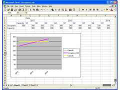 
Building occupancy
[/img]
You can see the capacity line is made up by filling a whole row of cells with the same figure. This seems a really clunky way to get a line across the
whole chart. I have several of these to do in one chart (several building) so it means loads of ugly lines of pointless numbers in the table.
If anyone can show me how to get a line across the chart without filling hundreds of cells it'd be great!
Thanks!
James
------------------------------------------------------------------------------------------------------------
"The fight is won or lost far away from witnesses, behind the lines, in the gym and out there on the road, long before I dance under those lights."
- Muhammad Ali
|
|
|
|
|
rachaeljf
|
| posted on 15/10/12 at 11:29 PM |
|
|
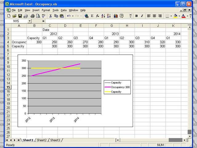
You only need to have x,y values for the two end points of the line, but it must be independent of the variable you are graphing; if you use a common
x column for two or more y columns on a graph then you have to fill in all the cells in each y column or it won't draw a continuous line.
So, just graph a separate "series" on the same graph, with the two end points. On your graph: four cells - 2012,300 and 2014,300 will draw
your horizontal line.
I tend to plot graphs in columns, but the above applies to x and y rows if that's how you have arranged your series.
Cheers R
|
|
|
ReMan
|
| posted on 15/10/12 at 11:32 PM |
|
|
That would seem the normal way of doing it.
You can drag the value to fill the range though you don't need to keep typing it.
Or you could just draw a lone on the graph at the right place
Or you could insert a linear trend line
www.plusnine.co.uk
|
|
|
James
|
| posted on 16/10/12 at 05:48 PM |
|
|
Thanks for the help guys!
------------------------------------------------------------------------------------------------------------
"The fight is won or lost far away from witnesses, behind the lines, in the gym and out there on the road, long before I dance under those lights."
- Muhammad Ali
|
|
|